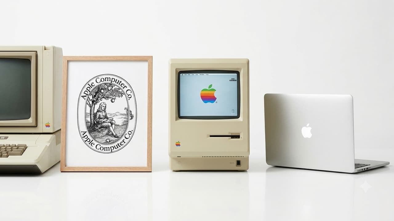
Apple’s iconic bitten logo evolved from a complex drawing of Isaac Newton to a simple, globally recognized symbol. Contrary to popular myths about Alan Turing or computer bytes, the bite was practically designed to distinguish the apple from a cherry.
Every time someone takes up an iPhone, opens a MacBook or switches on an iPad, a familiar sign captures the eye: a plain apple with a bite taken out of its right side. But have you ever pondered why one of the top technological businesses in the world would choose a bitten apple as its identity? The explanation is surprisingly practical and has little to do with the common hypotheses about the logo.
Apple’s logo has had a fascinating evolution, from a complex drawing of Isaac Newton seated under an apple tree to a simple symbol known across the globe. Its background incorporates a last-minute design choice, an odd creative command from Steve Jobs and an unintentional relationship to a computer phrase.
Apple’s First Logo Had Nothing to Do With the Iconic Bitten Apple
Before the now-familiar bitten-apple sign came along, Apple’s identity was a completely different one. Apple Computer was founded in 1976 and its initial logo was designed by Ronald Wayne, one of the original co-founders of the firm with Steve Jobs and Steve Wozniak.
Wayne’s first design was a detailed black and white image of Sir Isaac Newton sitting under an apple tree with an apple hanging over his head – much different from the simple logo we know today. The design was enclosed by an ornamental border including a quote from the words of English poet William Wordsworth.
The graphic symbolized knowledge and discovery, but it was hard to replicate and didn’t have the simple appeal a tech startup brand needs. As Apple was preparing to launch the Apple II computer, Steve Jobs desired a totally new visual identity. That choice ultimately led to the creation of one of the most recognizable logos in the history of advertising.
Why Is There a Bite in the Apple Logo?
There have been various ideas concerning the missing piece of the apple over the years. Others say it refers to the biblical Adam and Eve and the forbidden apple. Others tie it to Alan Turing, the British mathematician who is considered by many to be one of the fathers of modern computers and who died in 1954 from cyanide overdose.
Another frequent hypothesis is that the bite is a play on the computer term ‘byte’ – a unit of digital information. But the designer Rob Janoff has said several times that these interpretations were not the influence for his design.
The real reason was far more mundane: the bite was created to make the fruit identifiable as an apple rather than a cherry or other little spherical fruit. It also gave the design a quotidian, daily feel. The sensation of biting into an apple is one that people everyplace understand. Interestingly, the association with the term ‘byte’ was made only after the design had been completed. The initial purpose was not an association but an unintentional one.
Why Did Apple Choose Rainbow Colours for Its Logo?
The original Apple logo from 1977 was not monotone. It was made of six horizontal strips in rainbow colors. Many of the decision was about the technologies Apple was going to launch. The Apple II was the one that came out in 1977 and was different because it could show color. This was communicated via the colorful emblem which made the firm look different from competitors whose branding was mostly connected with conventional computer technology.
The rainbow design also provided Apple a more accessible and artistic character at a period when personal computers were still unknown to many customers. Janoff said the colors weren’t designed to convey a specific hidden message. It was more a visual design decision. For more than two decades, Apple’s identity was the rainbow-striped logo.
How Did the Apple Logo Become Black, Silver and Minimalist?
The rainbow stripes were gradually replaced by monochrome, translucent and metallic treatments. This change reflected Apple’s growing emphasis on clean product aesthetics. Rather than relying on multiple colours, the company increasingly used the recognisable silhouette itself to establish its identity. Over the years, the logo has appeared in black, white, silver and other finishes, depending on the product and branding requirements.
Apple’s logo is a fascinating case study in how a basic design may be more effective than a fancy image. It doesn’t have the company’s name, describe what its products accomplish or convey a sophisticated message. But the sign is immediately connected with one of the world’s most powerful technological firms.
Its success is also a branding lesson: a logo doesn’t require a convoluted past to be remembered. What started as a utilitarian way to tell an apple from a cherry became a global icon of technology, design and creativity. And perhaps most surprisingly, the iconic bite, frequently connected with ideas of knowledge, computers and Alan Turing, was initially inserted for one simple reason: to make sure everyone recognized an apple.